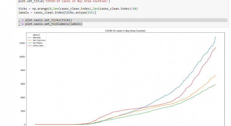
I’ve blogged before about how I’m doing some of my own data analysis on the COVID-19 numbers. One thing that I didn’t like about my graphs was that they didn’t contain an x-axis, which made them a little bit harder to read. In this (very quick) blog post I’ll show you how to add an […]
